New Mastercard logo enters icon era
Who knew 2019 would be known as “The Year #Priceless Went Nameless”?

The nameless one
Consumers have been conditioned to recognise corporate icons like McDonald’s “Golden Arches” and Nike’s “Swoosh”.
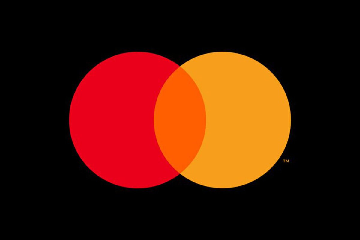
Now, with its decision to remove its name from its red and yellow brand mark, Mastercard is the latest major global brand to let a wordless logo do all the talking, reports David Penn at Finovate.
Mastercard chief marketing and communications officer Raja Rajamannar explains: “With more than 80% of people spontaneously recognising the Mastercard Symbol without the word ‘mastercard,’ we felt ready to take this step in our brand evolution. We are proud of our rich brand heritage and are excited to see the iconic circles standing on their own.”
The new logo – a pair of interlocking red and yellow circles – will be referred to as the Mastercard Symbol, and will be featured across cards, acceptance marks at online and off-line retail locations, as well as at major sponsorship properties.
The move is the second logo change for the company in recent years. The firm transitioned from “MasterCard” to “mastercard” in 2016, and added design changes that made the logo easier to display both horizontally and vertically. This latest logo redesign was developed by the same firm, Pentagram, that the company turned to in 2016.
Mastercard has a market capitalisation of $198 billion. The company connects consumers, FIs, businesses, and governments in more than 210 countries and territories, and reported revenue of more than $12 billion in 2017.


