Six steps to slash digital banking go-to-market time
One of the greatest issues that trouble digital banking teams worldwide is extended go-to-market time.
Challenger banks are hailed for their success in catering to emerging customer needs by rolling out new digital features regularly, while legacy banks may require years to do the same.
Smaller banking teams spend a lot of time and money on a journey to market, just to discover that a competitor has got there first and offers it better.
Too late they find their offerings do not compete within the market, and users are experiencing better services from competitors.
Even then they can struggle to provide basic digital offerings with burned out teams.
There are a number of factors which rank highly for go-to market time with banks. These include:
- Overcoming regulatory and technological obstacles
- Trying to redesign processes rivals have created with a better experience
- Understanding strong and weak points compared to others
- An inability to access best practices for each feature in development
- Problems with pinpointing features in which they focus on to be unique in the market
FinTech Futures Bank
In November, FinTech Futures had the opportunity to try FinTech Insights, a digital banking analysis platform from Scientia.
We used it to rank UK banks from onboarding to app functionality. We turned to FinTech Insights again to understand how banks’ go-to-market time can be decreased.
For that, we devised a test scenario that includes a small UK bank – FinTech Futures Bank – needing to enhance its services, namely in the cancelling and reordering of a card through an iOS channel.
Through the platform, we devised a series of steps through which the feature can be redesigned with a reduced product development time:
Know the marketplace, know your rivals
A bank should benchmark itself against its direct and indirect competitors in the UK market to find out which offer the desired feature.
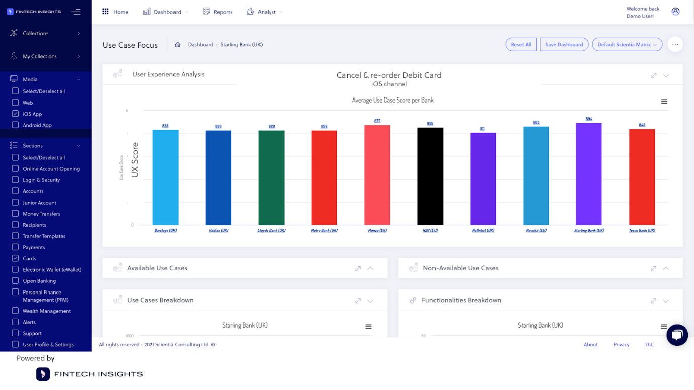
Using the platform we found that ten banks in the UK, including a mix of traditional players and challengers, offer a cancel and reorder feature.
Pinpoint the best and worst user journeys
After benchmarking, a bank should discover which competitors offer the best user journeys for the developing service, and which offer the worst.
Through objective UX evaluation, the bank can mark the journeys that are friendlier and most convenient for the user.
When we dipped into FinTech Insights we found this to be Starling and Monzo. Discoveries like these can influence the new design.
Find the best and worst user experience
Comparative data is always useful. We found through the Scientia platform an ability to analyse a range of competitors.
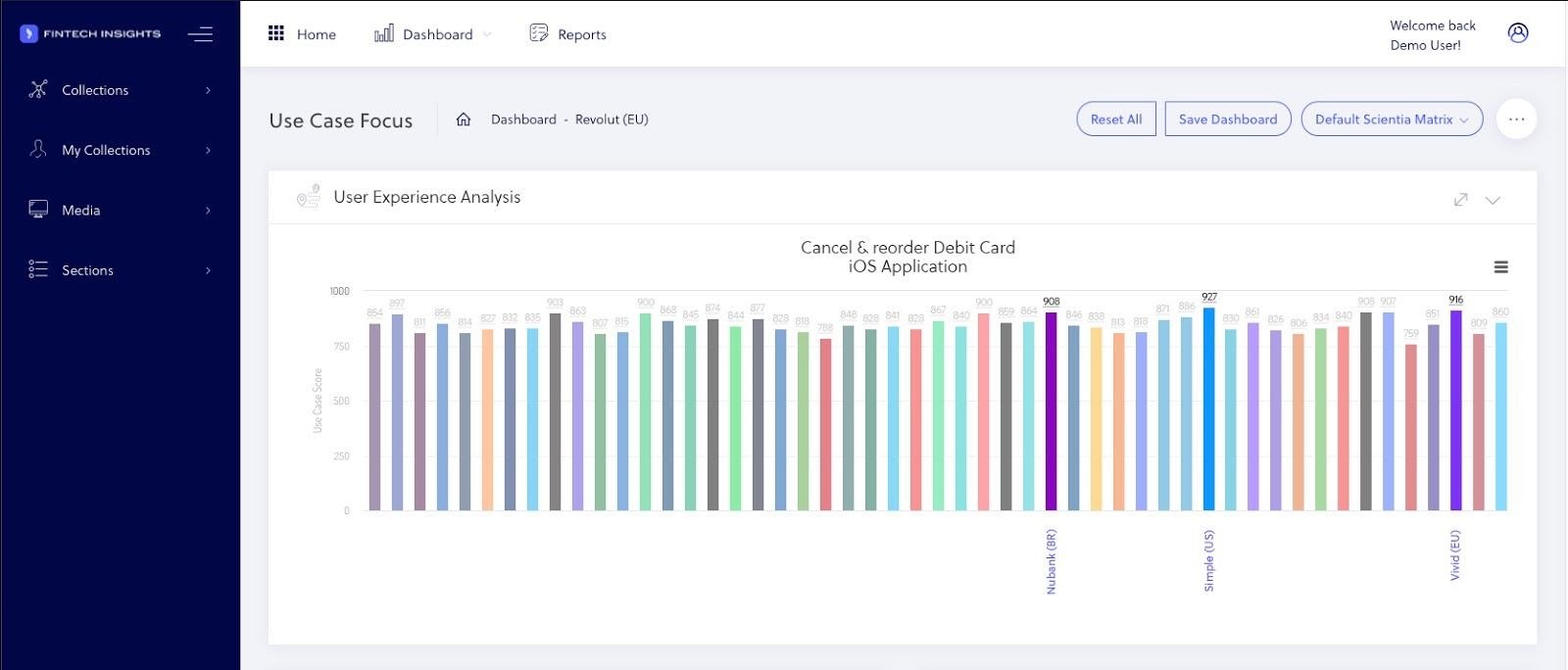
Using a system like this, the development team at FinTech Futures Bank can know the best user experience for cancelling a card across the market, not just in the UK.
Using this information, the bank can decide to draw elements from the design from the best UX-evaluated user journeys. These include Simple in the US, Vivid in the EU, or Brazilian challenger Nubank.
Dive deep into how the best features are implemented
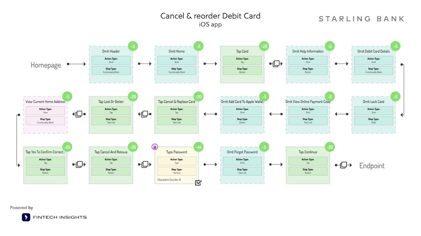
Next, we found that mapping a flowchart of the best journeys for cancelling and reordering cards showed the process in great detail.
Drawing on these data, bank developers can emulate the elements that fit better to their own design – avoiding serious customer friction points – and devise a plan on how to improve their feature.
See how others tackled the bank’s particular problem
What if the team at FinTech Futures Bank had concerns about security protocols, especially when sending cards to new addresses?
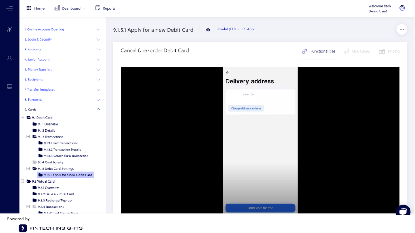
Using the platform, we had a look at other banks which have solved this issue. We found that Revolut offers customers the ability to change the delivery address for each new card. Instead of trying for weeks to build a solution, they can have the answer with a single log in.
Restructure the new feature according to best practices
Lastly, based on data about the best UX journeys in their market and worldwide, actionable solutions to the address security problem can build a concrete business case.
Our example bank could map out a redesign plan organised step-by-step from beginning to end.
Conclusions: What did our small digital banking team achieve?
In our little experiment we found that immediate benefit for a development team following these steps could be a reduction in time to conduct competitive analysis.
A bank can have an objective overview of all direct and indirect competitors’ abilities to offer specific features.
On top of that, they can explore the best practices for the user journey they wish to enhance which will enable them to market a fresh idea. While using the Fintech Insights platform our fictional UK bank could:
- Improve product roadmap development time, mapping out the whole process
- Avoid extra costs that come with extended and deadline-breaking delivery time
- Know which steps need a redesign, and which can be kept simple
- Have a solid foundation for their place in the market and build a business case for new products
Using competitive analysis like that from FinTech Insights your team can get behind the marketing and the documentation. It creates a window into how banks tackle and solve the same problems.
For more visit: scientiaconsulting.eu/fintech-insights


