Case study: Credit Agricole Bank Polska and Efigence – mobile banking app
When an out-of-the-box design drives supreme customer experience and sales boost: Efigence’s case study on Credit Agricole Bank Polska’s mobile app.
Creating a completely new banking application from scratch brings its own unique advantages. On the other hand, it is also quite challenging – especially when you deal with a multi-level project and you manage a very extensive team.
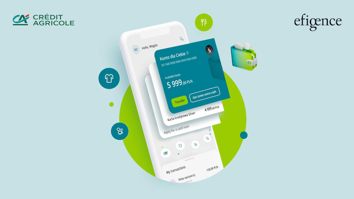
The Polish technology company Efigence was responsible for the UX/UI process and solutions in “CA24 Mobile – full of benefits” from Credit Agricole Bank Polska.
This case study is a story about an innovative banking application that can definitely compete with numerous fintechs and neobanks. It is also a story about providing appropriate leadership and UX governance. It answers the question of how to combine a user-centred design approach with the needs of a huge organisation such as a bank.
Let’s get started.
Background
Credit Agricole Bank Polska was running an application designed several years previously, so it needed new UX solutions and an app to be based on today’s consumers’ needs. There was one application for individual and corporate clients, plus separate applications to set up individual and corporate accounts. It became clear early on that a refresh or revamp simply would not do – only a new application built from scratch would support the bank’s new strategy, boost brand awareness and attract new customers.
Efigence assembled
Efigence, with the bank, put together a ten-strong UX/UI team that would work closely with the bank’s internal design team, several business teams and suppliers of the technology needed.
They kicked off with a discovery phase, to determine which areas required change, to identify user needs and to create a broad concept that would point the way for the future application with ideas and solutions.
The design phase enabled the Efigence team, working with the bank’s designers, to create a design system for digital products from scratch, including all user paths, while following an appropriate design leadership that would allow us to achieve cohesion and consistency in all our activities.
Garnering user needs in the initial phases and comparing with the bank’s business goals enabled Efigence and the bank to compile a list of requirements which were as follows:
- integration of account creation processes within the application;
- user support in everyday banking and learning about products; building a system that allows this;
- effective personal finance management (saving, investing, financial analysis, etc);
- building a platform for contacting the bank;
- ensuring an appropriate level of user security during the processes;
- integration of non-banking services;
- creating a space for acquisitions and upsells acceptable to the user;
- building an application around a huge and attractive bank discount program for users;
- ensure a system design that would allow easy creation of other digital products in the future.
Progressing naturally to the concept phase and the discovery phase, Efigence implemented its own Scattered Design Process prior to the classic agile process, maintaining a level of independence while integrating the work and design teams with the bank’s squad structure.
Tricks of the trade
When the Efigence team got to work, they had to blend in with the ready-made organisational structure created for this project – an agile organisation divided into tribes, squads, and so on.
Here, one vital aspect was to maintain the Efigence team’s independence and freedom of action while dispersing throughout and integrating with the bank’s squad structure. This could only be achieved through strong project leadership – an experienced Lead UX Designer working within the framework of a strict UX governance process and a culture of project rituals. This led to a coherent UX strategy and a consistent work approach while cooperating with the bank’s internal team of designers.
At this early stage, a major aim was to integrate the newly developed design process as seamlessly as possible into the wider agile process (which included parallel development) already operated by the organisation.
Prior to the start of development, at the mobilisation stage, Efigence implemented a separate discovery and concept phase. The phase started with analysing user needs, data from the current application and the bank’s business needs. This enabled us to create a target picture in the form of a comprehensive clickable prototype (hi-fidelity at almost final level), which became a go-to reference throughout the product development stage.
This target picture, accessible to design, business and development teams, provided the main concept for navigation, the information architecture and the process distribution structure for the whole application. It defined the main areas and their structure, the UX patterns used, and the appearance and operation of the interface.
The conceptualisation phase was when the design system started to take shape, accelerating the development of certain parts of the application over the coming stages. During the initial stage, about two months in length, it almost felt like the team was working with a complete solution based on the final interface.
The result of this approach was that all users and stakeholders involved saw the design of the application and could measure it against their needs. The next step was to raise awareness throughout this large organisation of how the project was shaping up, and of the UX approach taken; raising awareness not only among team members, but also through the top management level of the bank. This phase ended with a joint template, the concept that determined the activities of the entire project organisation.
“CA24 Mobile is an application full of benefits that offers unique customer experiences, through innovative design that is one step ahead of today’s market needs. It was thanks to the joint work with Efigence and an orderly process that it was possible not only to achieve the set goals, but also to apply such innovative solutions in the banking application” says Katarzyna Tomczyk-Czykier, Channel Excellence and Omnichannel Orchestration and Seamless Daily Banking Managing Director at Credit Agricole Bank Polska.
“The aspect of optimising everyday banking was one of the most important challenges that we set ourselves together with the client by co-creating the CA24 Mobile application – full of benefits.
“Convenient, a unique design and the possibility of a very wide personalisation of the application are some of the steps towards this goal. The Credit Agricole application is an example of the best UX and pro-customer practices and the best proof that the bank has long ceased to be just a bank, and is now a close companion of the customer in many daily activities” summarises Paweł Haltof, Client Innovation Director and Board Member at Efigence.
Endgame
An application was created which, vitally, can be used by both individual and corporate customers, with clear division into functional areas built into the navigation. We will cover some of these functional areas below.
The dashboard design provides a complete picture of changes in a customer’s important banking products, presenting balance details and recent transactions. This dashboard is very much the application’s calling card, as users log on to it on average several times a day. Each visit is greeted with fresh banking content to inform the user about what has changed since the last visit.
The Smart Accordion is an innovative interface solution that enables a quick outline of changes around the most important products. It allows the customer to effortlessly go deeper into information about a given service and the performing of key actions while providing space for promoting products. The history is arranged in the form of a “drawer”, giving the user a view of the last three transactions which can be switched with one touch to the full list, with accompanying search engine.
Efigence also proposed to place a solution on the dashboard called the River of Benefits. It is an innovative approach to the presentation of offers from the bank’s discount club, alongside its own proposals.
As an innovative step based on identified customer needs, two separate tabs were included covering banking products.
The Money tab focuses on the here and now, compiling accounts, cards and other fast-changing everyday banking products.
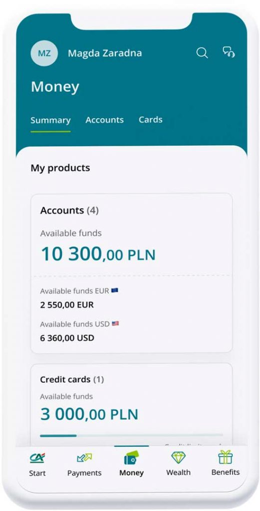
The Assets tab is a one-stop tab for resources such as savings, investments and paid-off parts of property that can be used to increase wealth. In the future, there is a plan to develop tools to support clients to analyse and plan expenses (the Personal Finance Manager/PFM).
Other important areas of the application included:
- A contact centre with a bank where the client can easily connect with an advisor.
- A coherent and non-invasive system of upselling and promotion; a network of advertising placements scattered throughout the entire application in various forms including elements similar to interface controls (such as buttons), initiation of sales processes, product ghosts (without advertising communication) as well as stories, something unusual for banking, but an attractive visual form with a marketing message.
- A benefits club, where the customer will find discounts, vouchers for over 10,000 stores and retail and service outlets – a definite distinguishing feature of the Credit Agricole Bank Polska’s application on the market. Offers are personalised, and therefore tailored to the needs of customers. In turn, the method of implementing the discount by the customer is very simple and intuitive.
- A centre for non-banking services – payments for highways, parking lots, tickets and others – coming soon.
- In the near future, the application will also include a global search engine, which will not only search the entire application, but also provide an alternative form of navigation, enabling access to functionalities.
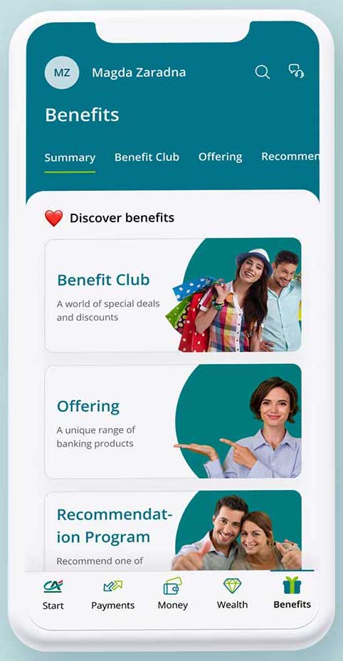
The CA24 Mobile application takes us beyond the banking sphere, helping customers to connect various aspects of their lives through the bank. The new Credit Agricole Bank Polska app’s success is quantifiable: the application currently has 582,000 active users, a number that is steadily growing. The Efigence team have stated that they are delighted to be a part of such growth and development.
Sponsored by Efigence


