COVID-19 analytics: the lesson for those involved in policy management
Contemporary government policy interventions are increasingly defined by data, indicators, and metrics.
Furthermore, data-driven ‘radical incrementalism’ methodologies devised by the now independent UK government Behavioural Insights Team (BIT) have been successfully used worldwide.
BIT’s usual process is to create several policy variants, test them, and then selecting the best option. This is a luxury that we can’t afford in a crisis like the COVID-19 pandemic.
Yet what we can do is compare the progress and outcomes of different policies adopted by choices across different countries in the hope of learning to improve the outcomes.
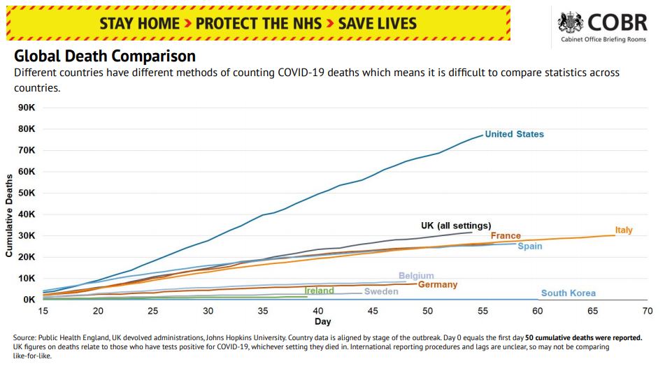
The following extract below from UK government coronavirus briefing slides is attempting to do just that.

But can you see what’s wrong with this picture? A close analysis reveals that it has a number of major flaws.
For a start, a consistent definition of ‘“COVID death’” across countries and throughout the analysis timeline is needed if we want to make an accurate comparison in terms of death rates. This graph features some countries that have included non-hospital deaths, as well as others that have not. Moreover, some countries only counted deaths of those individuals who had tested positive for the virus, while others included ‘suspected’ cases as well.
The timeline is also skewed as it sometimes counts deaths that occurred up to two weeks before.
Furthermore, the figures are not adjusted for population size. This, coupled with the absence of any reference points of death rates from previous years, is very misleading.
It’s also worth pointing out that, in its quest for simplicity, the chart only features deaths related to the virus. It ignores other second-order effects such as the impact on life expectancy due to postponed treatments, mental health challenges, and economic hardship.
All of this begs the question: is the chart informative at all, given its data and its visualisation issues?
The importance of good data
This case clearly demonstrates the importance of thinking about the composition of datasets, data measurements and comparison processes, underlying assumptions, criteria, and definitions of success before any data analysis begins. It’s a good lesson for those involved in internal company policy management.
So, the first thing a company policy manager needs to do is choose the right data points, right? Unfortunately, it’s not that easy! First and foremost, a manager needs to be in a position to be able to choose what to measure. They need access to a wide range of metrics. Without this, they will just end up measuring what they can, not what they need to.
If your policy management processes are manual and, relying on multiple disconnected systems and generic tools, you could end up spending 200 employee hours just to prepare a single management report. Manually combing through stockpiles of documents, spreadsheets, and emails is not scalable and it’s certainly not agile.
When thinking about analytics in your firm, consider your policy management processes. Are they as automated as they could be?
One thing you can be sure of is that change is constant. Regulations, technology, environments, mergers and acquisitions, business relationships… stuff happens.
In today’s dynamic, interconnected, disrupted business environment you always need to be ready for change. Modern data-enabled systems and processes are the key to staying competitive. Regulatory technology, which has advanced tremendously over the past few years, is the way forward. It’s time for an upgrade!


